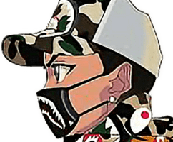
in my opinion I choose the right letter because it helped me create a colorful project
– but next time I must higher my ISO so I can take clearer photos
Also, the I made a nice project even though I used letters that made a word people wouldn’t think of
this made my project different from others.
what I learned
I learned how to use white outline strokes on my images.
which made my photos pop.
Also, I learned how to sharpen my images if they were taken blurry.
lastly, I learned how to use the colors of my images and use them to make my background match using the gradient tool.